Image
Usage
The Image component allows for the configuration and display of a image item on a page. The image features in-place editing.
The Image Component features adaptive image selection and responsive behavior with lazy loading for the page visitor as well as easy image placement and cropping for the content author.
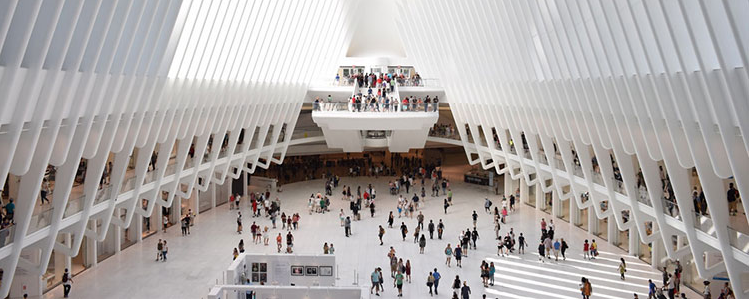
Examples
Authoring
Edit Dialog
The edit dialog allows the content author to crop, modify the launch map, and zoom the image.
Note
The in-place editor can also be used to modify the image. Due to space limitations, only basic options are available in-line. For full edit options, use the full-screen mode.

Display modes
Normal 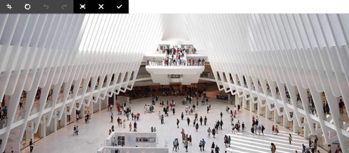
Fullscreen 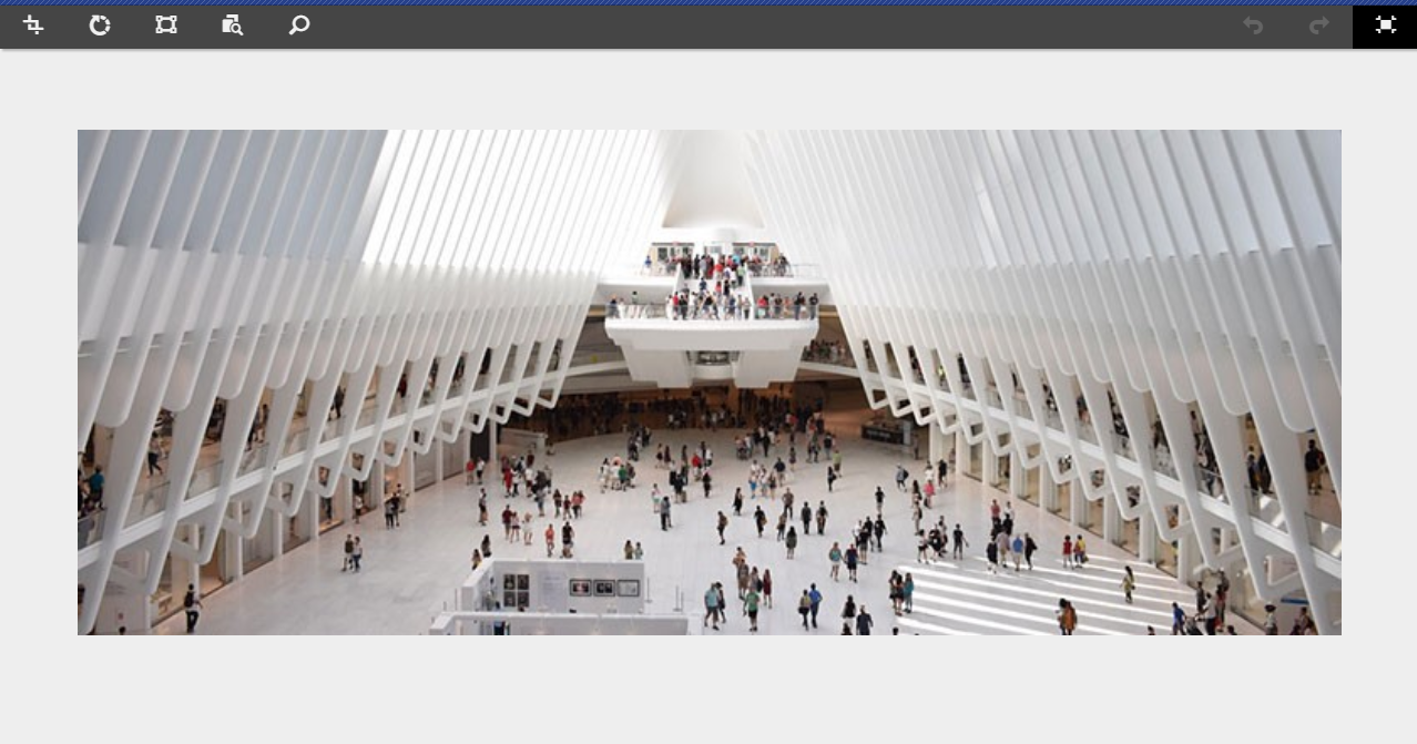
The Toolbar
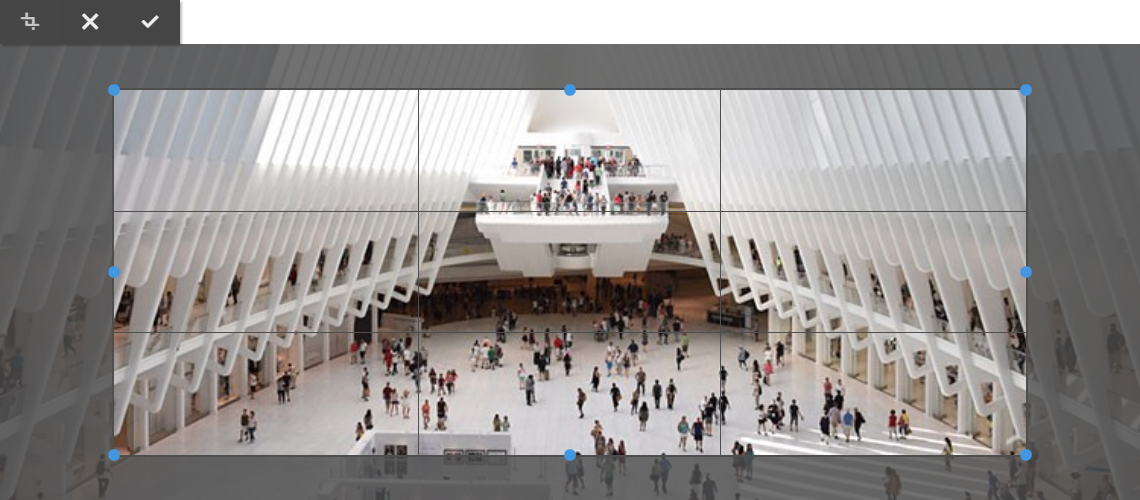
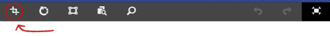
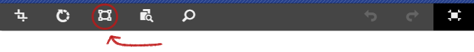
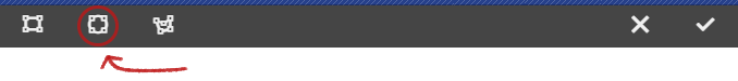
Crop
| Action | Mode | Description |
|---|---|---|
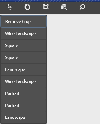
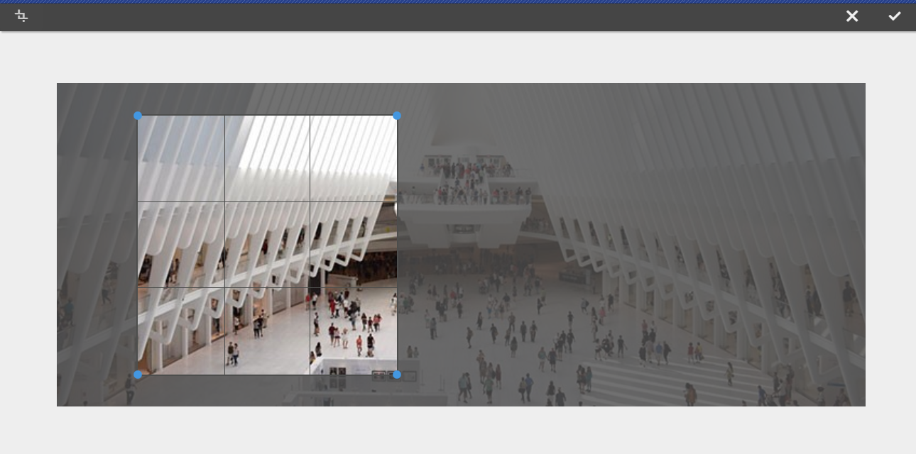
| Crop | Normal | Clicking it on normal mode will provide you with a freehand resizable cropping area. |
| Fullscreen | Clicking it on fullscreen mode will provide you with a predefined resizable cropping area. |
Once a crop option is selected, use the blue handles to size the crop on the image.
Normal

Fullscreen
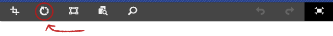
Rotate Right
| Action | Mode | Description |
|---|---|---|
| Rotate Right | Normal/Fullscreen | Clicking it will rotate the image 90° to the right (clockwise). |
Normal

Fullscreen
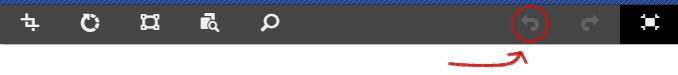
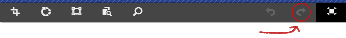
Undo and Redo
| Action | Mode | Description |
|---|---|---|
| Undo | Normal/Fullscreen | Clicking it will revert back any changes. |
| Redo | Normal/Fullscreen | Clicking it will revert back any undid changes. |
Normal


Fullscreen
Enter and Exit Fullscreen mode
| Action | Mode | Description |
|---|---|---|
| Enter Fullscreen | Normal | Clicking it will switch the display mode to fullscreen. |
| Exit Fullscreen | Fullscreen | Clicking it will switch the display mode to normal. |
Normal

Fullscreen

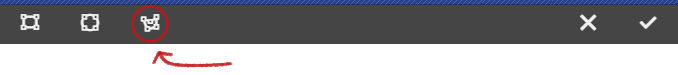
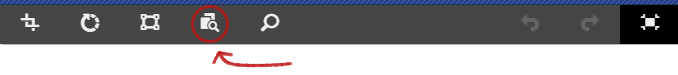
Launch Map
Not available on normal mode.
| Action | Mode | Description |
|---|---|---|
| Launch Map | Fullscreen | Use this option to apply a launch map to the image. Selecting this option opens a new window allowing the user select the shape of the map. |
Types
Add Rectangular Map
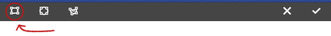
Add Circular Map
Add Polygon Map
By default adds a triangle map. Double-click on a line of the shape to add a new blue resize handle on a new side.
Once a map shape is selected, it is superimposed on the image allowing for resizing. Drag and drop the blue resize handles to adjust the shape.
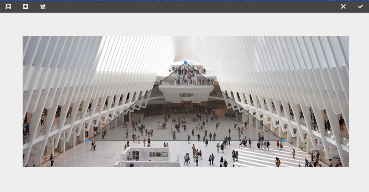
After sizing the launch map, click on it to open a floating toolbar to define the path of the link.
| Field | Description |
|---|---|
| Path | Use the Path Picker option to select a path in AEM. If the path is not in AEM, use the absolute URL. Non-absolute paths will be interpreted relative to AEM. |
| Alt text | Alternative description of the path destination |
| Target | Same tab, New tab, Parent Frame, Top Frame |

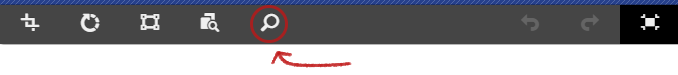
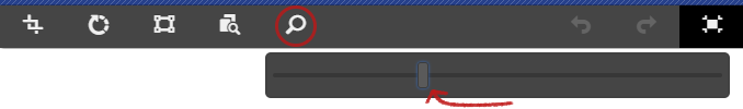
Zoom Slider and Reset Zoom
Not available on normal mode.
| Action | Mode | Description |
|---|---|---|
| Zoom Slider | Fullscreen | Use this option to display a slider to control the zoom level of the image. |
| Reset Zoom | Fullscreen | If the image has already been zoomed, use this option to reset the zoom level. |
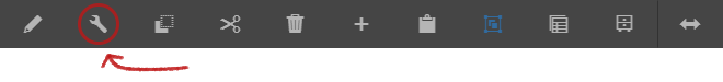
Configure Dialog
The configure dialog allows the content author to define the image and how it will behave and appear for a visitor to the page.
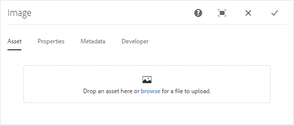
Asset Tab
| Action | Description |
|---|---|
| Browse | Tap or click to upload from a local file system. You may also drag-and-drop an image from the Assets tab after toggling the AEM side panel. |
| Clear | Tap or click to de-select the currently selected image. |
| Edit | Tap or click to mange the renditions of the asset in the asset editor. |
SVG and GIF Support
The Image component also supports Scalable Vector Graphics (SVG) and Graphics Interchange Format (GIF)
Note
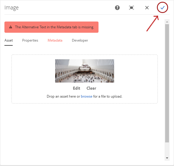
You need to provide the alternative text for the image asset in the Metadata tab before clicking the submit icon.
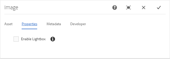
Properties Tab
| Field | Description |
|---|---|
| Enable Lightbox | When checked, allow the image to be displayed in a lightbox or pop-up dialog box. |
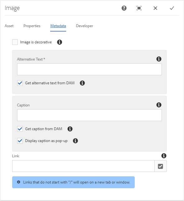
Metadata Tab
| Field | Description |
|---|---|
| Image is decorative | Check if the image should be ignored by assistive technology and therefore does not require an alternative text. This applies to decorative images only. |
| Alternative text | Textual alternative of the meaning or function of the image, for visually impaired readers. |
| Get alternative text from DAM When checked the image’s alternative text will be populated with the value of the dc:description metadata in DAM. | |
| Caption | Additional information about the image, displayed below the image by default. |
| Get caption from DAM When checked the image’s caption text will be populated with the value of the dc:title metadata in DAM. | |
| Display caption as pop-up When checked, the caption won’t be displayed below the image, but as a pop-up displayed by some browsers when hovering over the image. | |
| Link | Link the image to another resource. |
| Use the selection dialog to link to another AEM resource. | |
| If not linking to an AEM resource, enter the absolute URL. Non-solute URLs will be interpreted as relative to AEM. |
NOTE
The Alternative Text is a required field.
Lazy Loading on Images
Lazy loading images reduces initial load time and page weight, allowing for a quicker page load time. Bandwidth conservation – Lazy loading conserves bandwidth by delivering content to users only if it's requested
Lazy loading feature is now available for the image component, authoring it is a shown GIF below.
This feature is disabled by default and can be enabled as needed.
Copyright © 2025. All rights reserved. Informa Markets, a trading division of Informa PLC.