Authoring
The AEM editor provides powerful functionality to build pages. Through the editor you can add, move, and customize components.
Adding spacing on top and bottom of a component
To add spacing, switch to layout mode by click the icon in the component toolbar shown below.

Then click the spacing icon
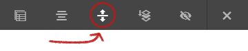
and select the amount of spacing for the top and bottom from the dropdown provided.
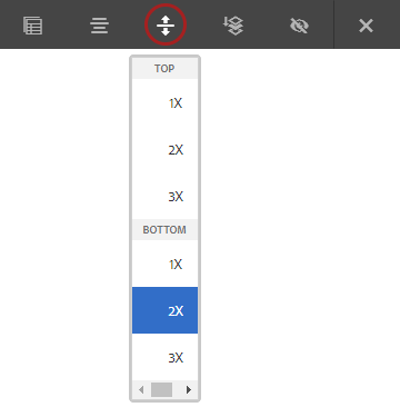
 Spacing Option enhancement
Spacing options are now up to 10X for top and bottom of components.
This is demonstrated below.
Making and publishing changes
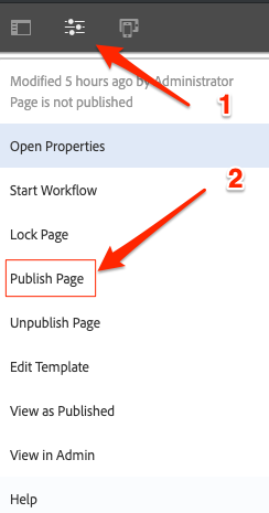
You can click the page thumbnail to view the actions for a specific page.
Navigation of the Editor

The top left of the editor provides access to open the sidebar or to perform various actions for the page.
Assets
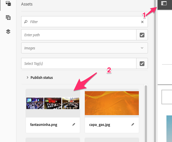
Assets can be utilized to bring images into image components on page.
Components
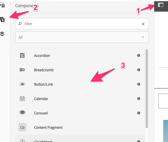
In the sidebar the components list can be used to drag and drop or place new components on to the page. The components can be filtered by category or you can search for specific components.
Page Options
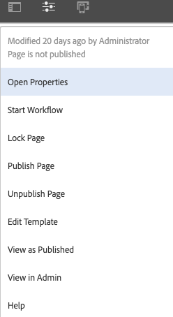
You can select the page options item at the top left to view various options and actions for the page.
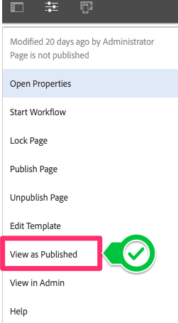
You can select View as Published to view the page as it would look to a user.
Editing Mode

You can change the editor mode or activate preview mode by making a selection in the top right.
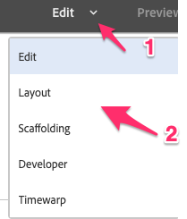
The following editing modes are available:
- Edit
- Layout
- Scaffolding
- Developer
- Timewarp
The two modes you will use most often are Edit and Layout
Page Content
You add content or create new components by opening the component sidebar and dragging components onto the page
components can be placed into Drag components here boxes in the editor

Toolbar

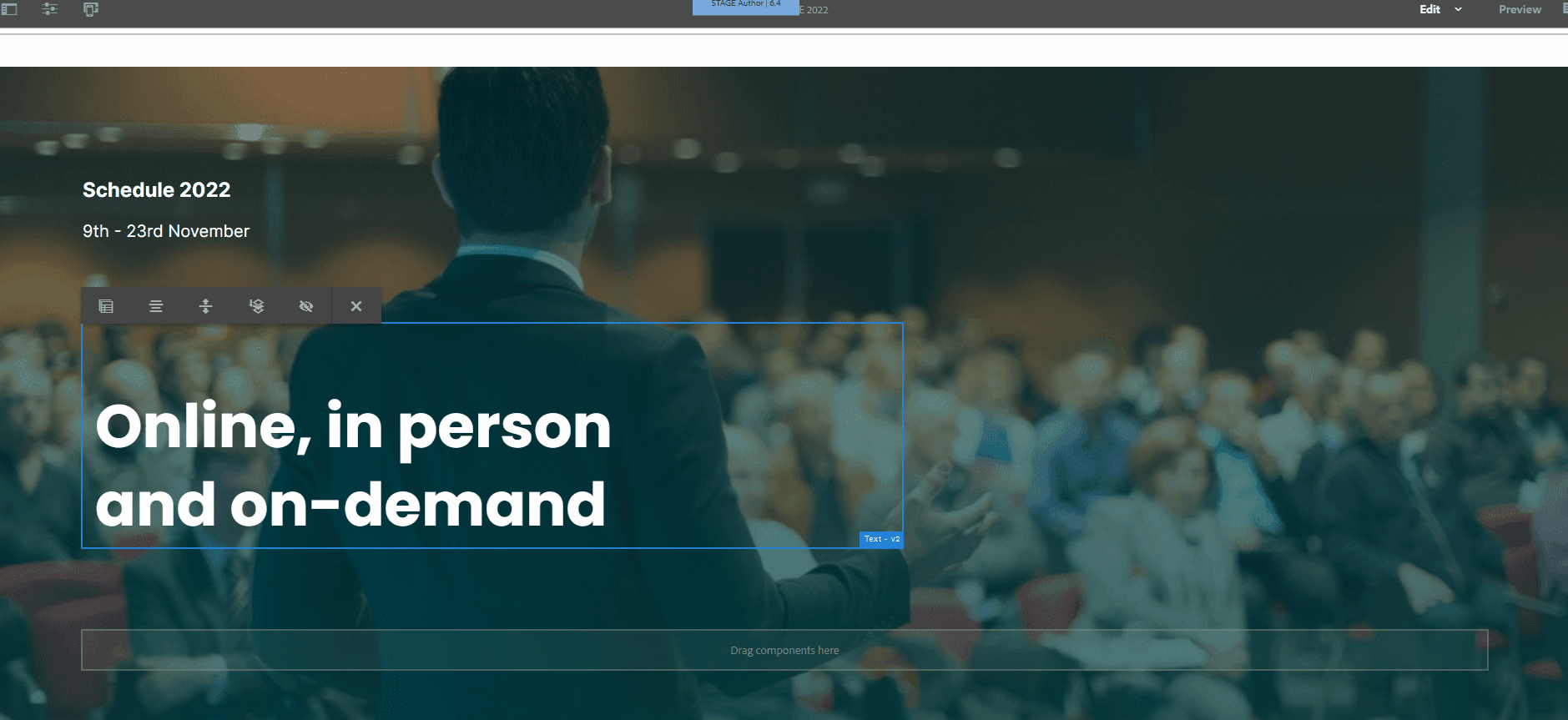
The toolbar can be activated by tapping or clicking a component in the page. Different options are available for different components.
Inline Edit

Activates inline editing for the component, allowing you to adjust text, images, and titles on the fly.
Configure Component (Open Dialog)

Opens the component properties to configure an individual component
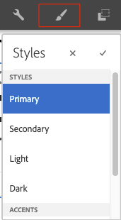
Styles

Lets you apply various Styles to the selected component. See the component help pages for more information.
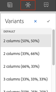
Variants

Let’s you change how the component behaves or works by selecting various Variants
Copy

Copy the selected component.
Warning
You should avoid copying components between pages or sites, this does not follow best practices.
Cut

Cut the component and store it in the clipboard.
Delete

Delete the currently selected component.
Paste

Paste a component from the clipboard into the selected container.
Insert Component

Insert a new component above the currently selected component.
Group

Group multiple components together to make moving them easier.
Parent

Activate a Parent of the currently selected component.
Convert to Experience Fragment

Turn this component into an Experience Fragment.
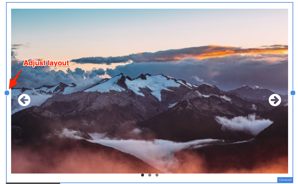
Adjust Layout

Adjust the size and offset of the currently selected component.
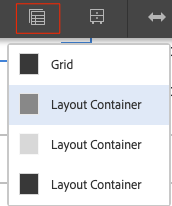
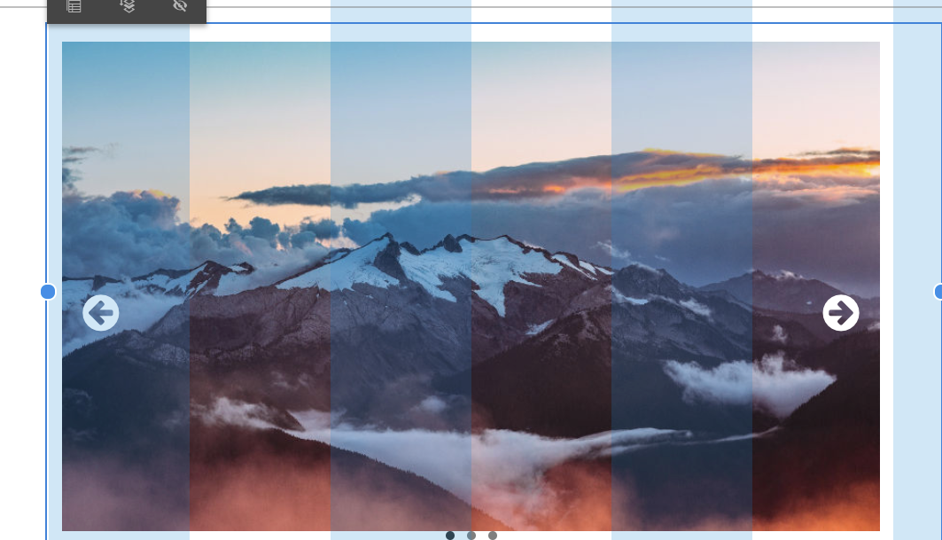
Layout
You can adjust the offset and size of various components within the page grid by entering layout mode.
In layout mode you’ll have drag points to adjust the component’s size or offset changing it’s position in the page.

Alternatively, you can use the layout icon after left clicking a component to switch to the layout mode.
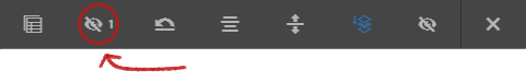
Hiding a Component Feature
This allows you to hide/unhide a component on certain viewports. This feature is available on v2 of AEM 6.4.
Basic steps in hiding a component
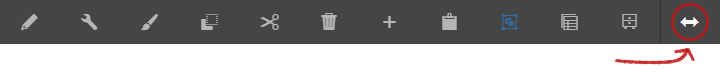
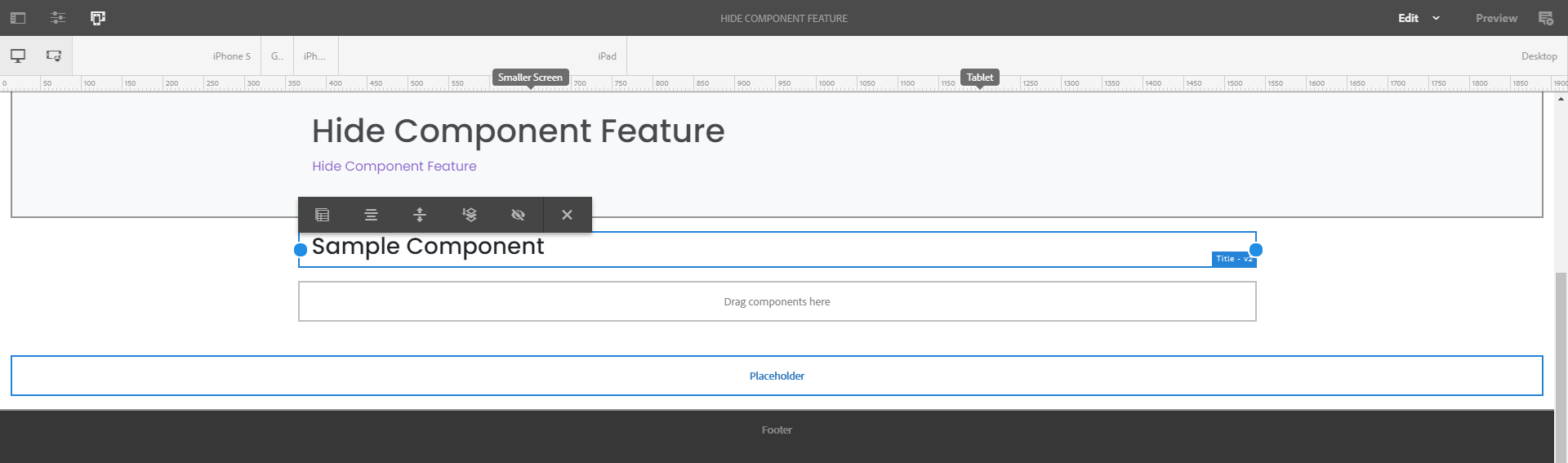
In author, left click the component to open the toolbar, then click on the Layout icon to the right as shown below.
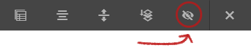
On the next set of tools, click the Hide Component (eye-like) icon to enable the hide feature.
NOTE
To go back to the previous toolbar, click the “x” icon to the right of the hide icon.
Once hidden, a red icon to the right of the component will appear indicating that it is now hidden and will not be displayed on the website except on author.

Hiding a component on different viewports
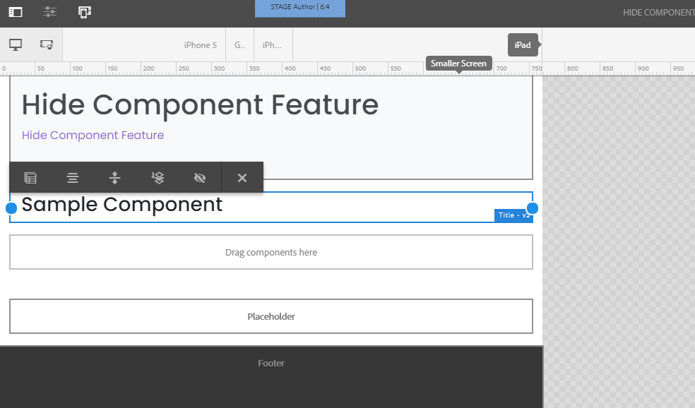
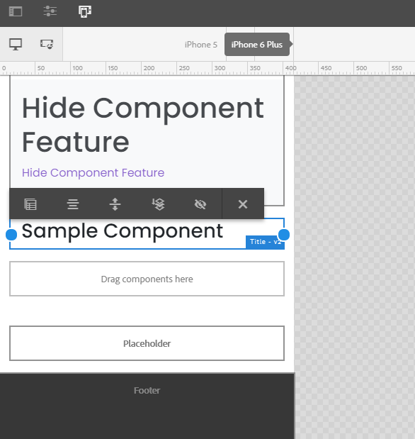
The viewport emulator is visible on the top section of the page after clicking the layout icon on author.
You will have three viewports to choose from: desktop, tablet, and mobile. Select by clicking which viewport you wish to hide/unhide the component then follow the basic steps mentioned above.

So, from right, the breakpoints are:
- Desktop
- Tablet
- Mobile
Desktop (Default)
Note
Component hidden on desktop will also be hidden by default on tablet and mobile viewports. So, you have to switch viewport and unhide them.
Tablet
Mobile
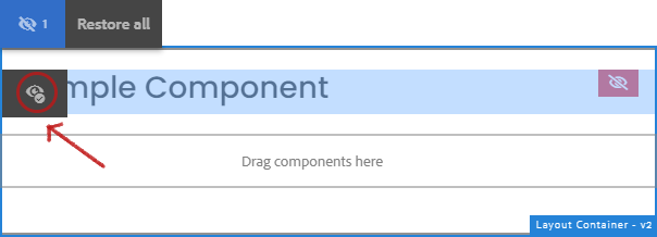
Unhiding the component
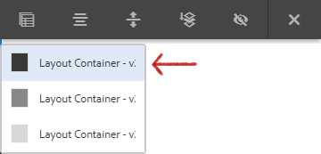
To unhide the component, click the Parent icon while on layout view as shown below.

Then click the immmediate layout container from the dropdown.
On the next toolbar, click the Show Hidden Components icon.
Now, to unhide the component, click the eye-with-check-like icon to the left of the component to disable the hide feature.
Copyright © 2025. All rights reserved. Informa Markets, a trading division of Informa PLC.