Carousel
The Carousel component allows the content author to present content in a navigable carousel.
Using the Carousel Component, the content author to organize content in a rotating carousel of slides.
The Carousel component can have Image components or Teaser Components dropped into it.
Examples

Authoring
Configure Dialog
The configure dialog allows the content author to define the carousel and how it will behave and appear for a visitor to the page.
Properties Tab
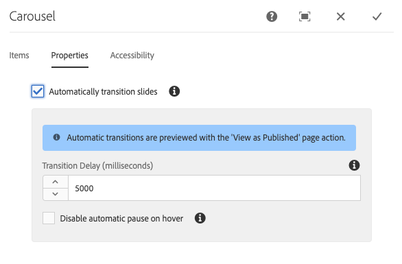
On the Properties tab, the content author can set the slides to automatically transition.
- Automatically transition slides - When active, the component will automatically advance to the next slide after a specified delay.
- Transition Delay - When Automatically transition slides is selected, this value is used to define the delay between transitions (in milliseconds).
- Disable automatic pause on hover - When Automatically transition slides is selected, the carousel transition will automatically pause whenever the cursor hovers over the carousel. Select this option so that the transition will not pause.
Note
The slide advance controls are not enabled when in Edit mode. Use Preview or the View as Published option to interact with the carousel as a reader of the published content would.
The auto-advance feature is not enabled when in Edit mode. Use View as Published option to see the auto-advance feature as a reader of the published content would.
Items
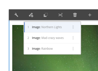
You can switch between items in authoring mode by tapping or clicking the Items button.
Styles
The carousel comes with a number of available styles that will be customized for your specific site and theme. You can use the styles selector to pick a style for your carousel.
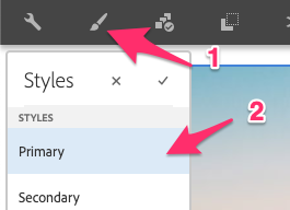
Available Styles
- Primary
- Secondary
Items Tab
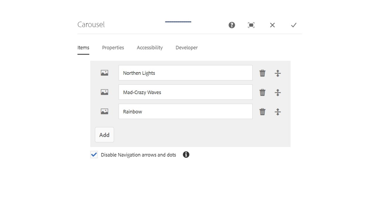
Use the Add button to open the component selector to choose which component to add as a tab. Once added, an entry is added to the list, which contains the following columns:
- Icon - The icon of the component type of the tab for easy identification in the list. Mouse over to see the full component name as a tooltip.
- Description - The description used as the text of the tab, defaulting to the name of the component selected for the tab.
- Delete - Tap or click to delete the tab from the tabs component.
- Reorder - Tap or click and drag to order the tabs.
- Disable Navigation arrows and dots - When checked, it will disable the navigation arrows and dots on the component.
Carousel Sliding Transition
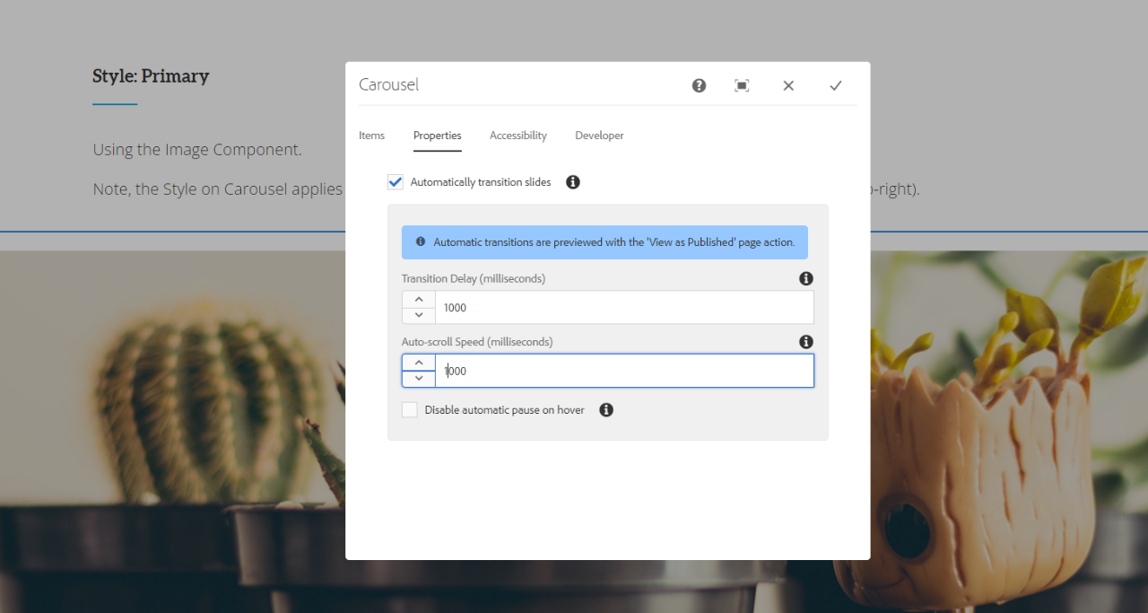
When the user need a sliding transition to be performed on carousel items, make sure you to provide the Transition delay and the auto scroll speed with different values.
A. when the transition delay and the Auto scroll speed is set to same values (ex: 1000) as per the above screenshot, there is small bug/open issue found in carousel where a 10-15px of white space is getting added when carousel starts to slide.
B. Please author the carousel items in such a way that the transition delay and the auto scroll speed values are set with different values to avoid such issues.
Thumbnail displays for the Carousel
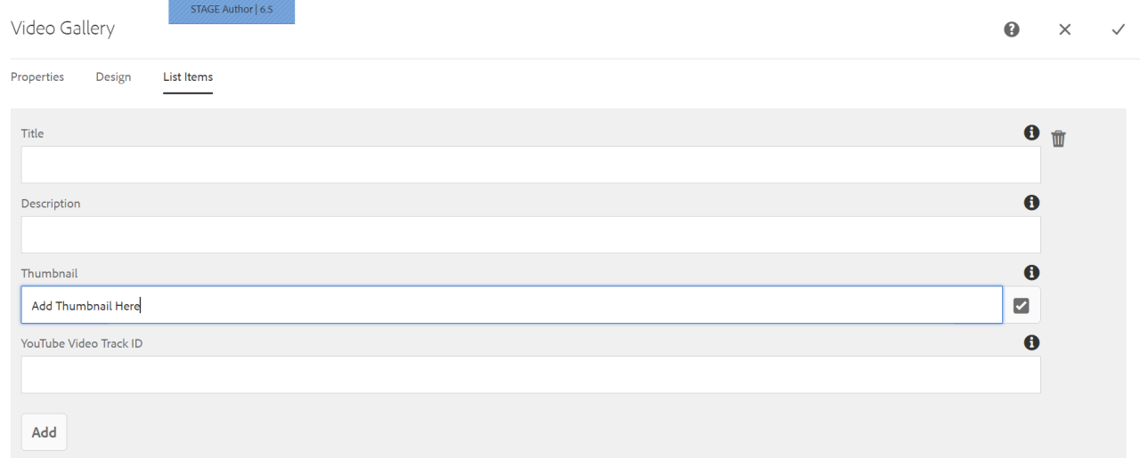
Thumbnails displays are now available for the Carousel Media Component. When an Author is ready to display thumbnails for their event videos, the carousel component will now be able to display their videos as thumbnails in a carousel manner that will open a video player to showcase videos for their events..
Copyright © 2025. All rights reserved. Informa Markets, a trading division of Informa PLC.