Grid
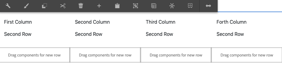
The Grid component allows for the configuration and display of a multi-column, multi-row grid. It can have various sizes and combinations columns. By default the items added to a new row will fill in from left to right.
Note
You cannot have empty cells between two columns.
Warning
Nesting of the Grid component is discourage, use a Layout Container instead, or avoid nesting when possible
Examples
Authoring
Configure Dialog
The configure dialog allows the content author to define the grid and how it will behave and appear for a visitor to the page.
Variants
The grid can be configured to display a number of variants, use the variant wheel to pick your column configuration
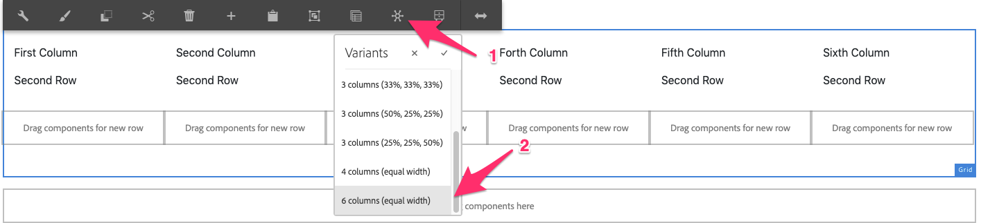
Available Variants
- 2 Columns (50%, 50%)
- 2 Columns (33%, 66%)
- 2 Columns (66%, 33%)
- 3 Columns (33%, 33%, 33%)
- 3 Columns (50%, 25%, 25%)
- 3 Columns (25%, 25%, 50%)
- 4 Columns (Equal Width)
- 5 Columns (Equal Width)
- 6 Columns (Equal Width)
Styles
The grid comes with a number of available styles that will be customized for your specific site and theme. You can use the styles selector to pick a style for your grid.
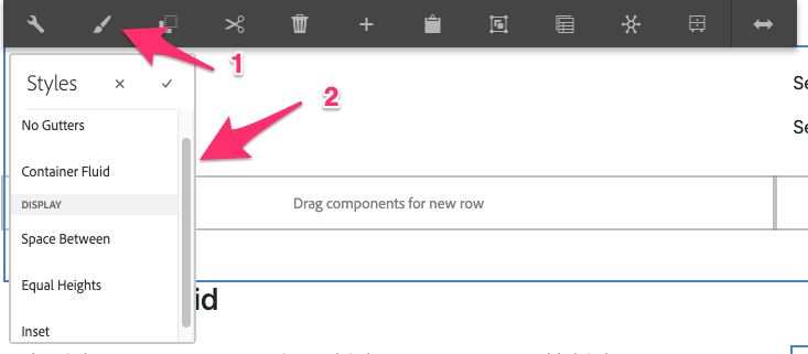
Available Styles
- No Gutters
- Container Fluid
- Space Between
- Equal Heights
- Inset
When to and why use the Grid component
Use Grid component if you want to display a tabulated data, an array of events that requires multiple rows, or any table-like information such as list of speakers with profile picture. However, if you only want to adjust the layout or position the elements such as from one column to two columns, the grid component is not design for such requirement. You should use the Layout Container component instead.
Copyright © 2025. All rights reserved. Informa Markets, a trading division of Informa PLC.