Image Gallery
Usage
The Image Gallery component allows for the configuration and display a gallery of images on the page.
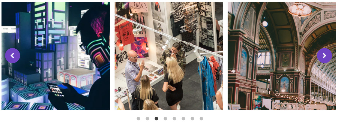
The gallery can be displayed as a grid or as a sliding list that the user can scroll through.
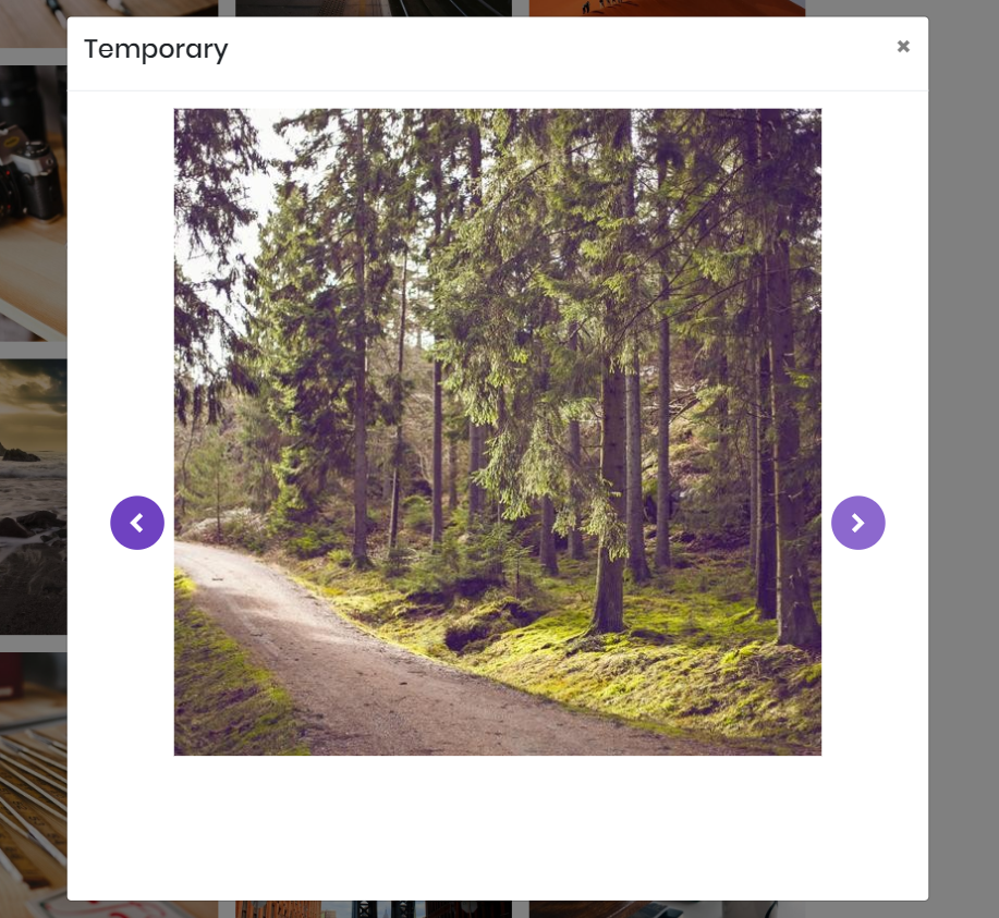
The when an image is tapped or clicked by a user a lightbox will open displaying the image in a larger scale, and allowing the user to scroll through the images.
The lightbox feature can be disabled in the configuration dialog box.
Examples

Authoring
Configure Dialog
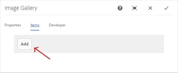
The configure dialog allows the content author to define the image gallery and how it will behave and appear for a visitor to the page.

Properties Tab
| Field | Description |
|---|---|
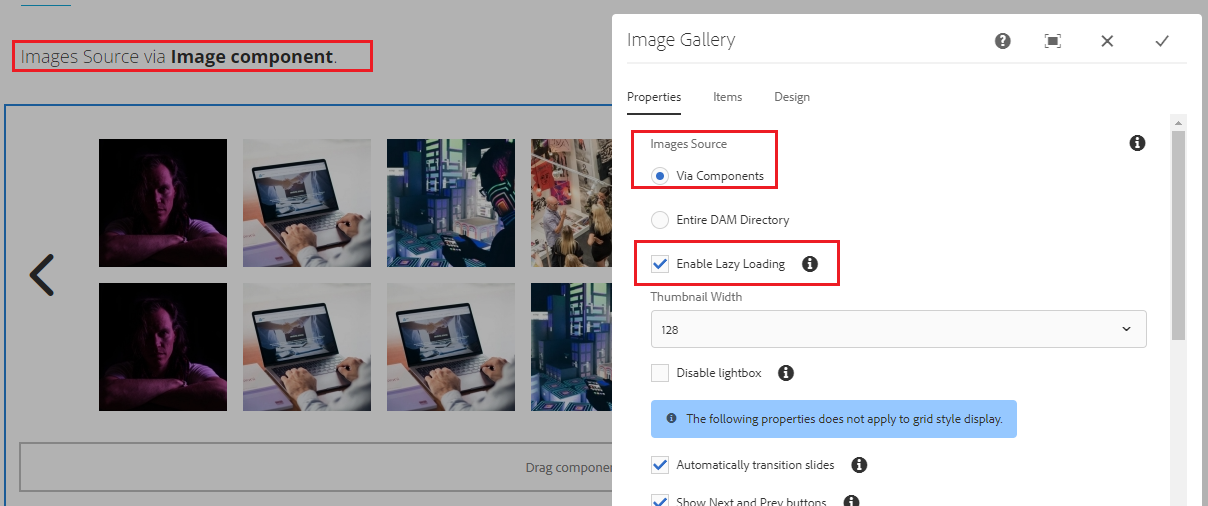
| Via Components | Use this option to add the image gallery items manually. |
| Entire DAM Path | Use this option to add the image gallery items in bulk via the DAM. In the Items tab, use the Selection Dialog button to choose the folder where the images are uploaded in DAM. |
| Thumbnail Width | Select the initial width of the image thumbnails to display. Available widths are 512x512, 256x256, 128x128, 64x64, and 32x32 pixels. |
| Disable Lightbox | If checked, will not allow the images to be displayed in a lightbox. The images will display in a lightbox by default. |
| Automatically Transition Slides | If checked, will automatically transition between slides. |
| Show Next and Prev Buttons | If checked, will display the Next and Prev buttons. The buttons are hidden by default. |
| Show Dots Navigation | If checked, will display the clickable dots below the scrolling images. The dots are hidden by default. |
| Transition Delay | The delay (in milliseconds) before transitions to the next slide. |
| Items to Slide | The number of items to slide at a time. |
| Items to Show | The number of items to show at a time. The value must lower than the number of image gallery items. |
| Enable Automatic Pause on Hover | If checked, will pause the automatic transition between slides when hovering on the image gallery. |
Note
The value for Items to Show must be lower than the number of gallery items.
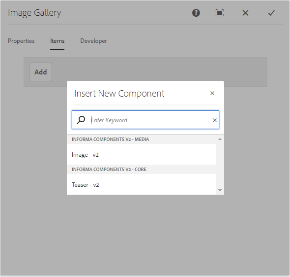
Items Tab
Via Components
If you’ve chosen ‘Via Components‘ in the Properties tab as the source of images, use the Add button to add additional images. Once added, an entry is added to the list, which contains the following fields:
| Field | Description |
|---|---|
| Title | The title of the image. |
Once the desired number of gallery items are added, click the check icon to confirm.
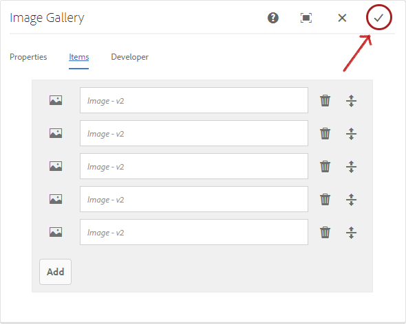
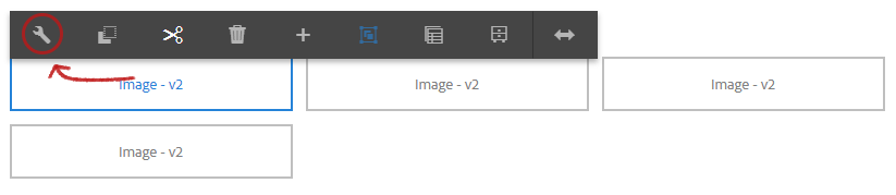
Configure each Image component, adding the assets and necessary alternate text. Click here for details on how use the Image component.
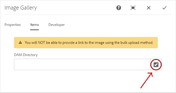
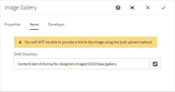
Entrire DAM Directory
If you’ve chosen ‘Entire DAM Directory‘ in the Properties tab as the source of images, use the Selection Dialog button to provide the path to the folder in DAM where the images were uploaded.
Note
You will NOT be able to provide a link to the image using this upload method.
Styles
The image gallery comes with a number of available styles that will be customized for your specific site and theme. You can use the styles selector to pick a style for your image gallery.
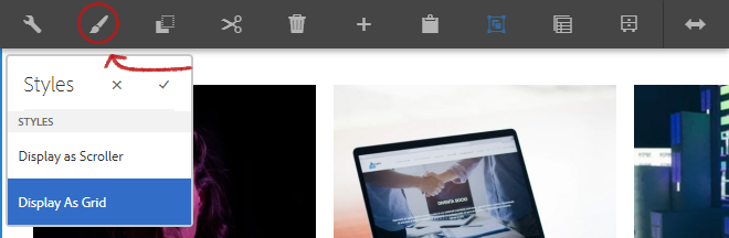
Available Styles
- Display as Scroller
- Display as Grid
| Style | Description |
|---|---|
| Display as Scroller | When selected, will display the images in transitioning slides. |
| Display as Grid | When selected, will display images in grid. |
You can now apply the lazy loading feature on all the images added via components in a single click instead of doing it one by one in the individual image components.
This provides several valuable benefits, particularly for improving page speed and user experience, and reducing bandwidth usage and costs. Improved page performance will load the page faster, improve SEO ranking, keeping the visitors engaged, reducing bounce rate, and increase conversion rate.
Copyright © 2025. All rights reserved. Informa Markets, a trading division of Informa PLC.