Layout Container
Usage
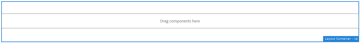
The Layout Container component allows for the configuration and display of a layout container item on a page.
The layout container is the basic container for all other components on the page. Any component can be placed into a layout container.
Examples
Authoring
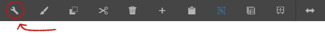
Configure Dialog
The configure dialog allows the content author to define the layout container and how it will appear for a visitor to the page.
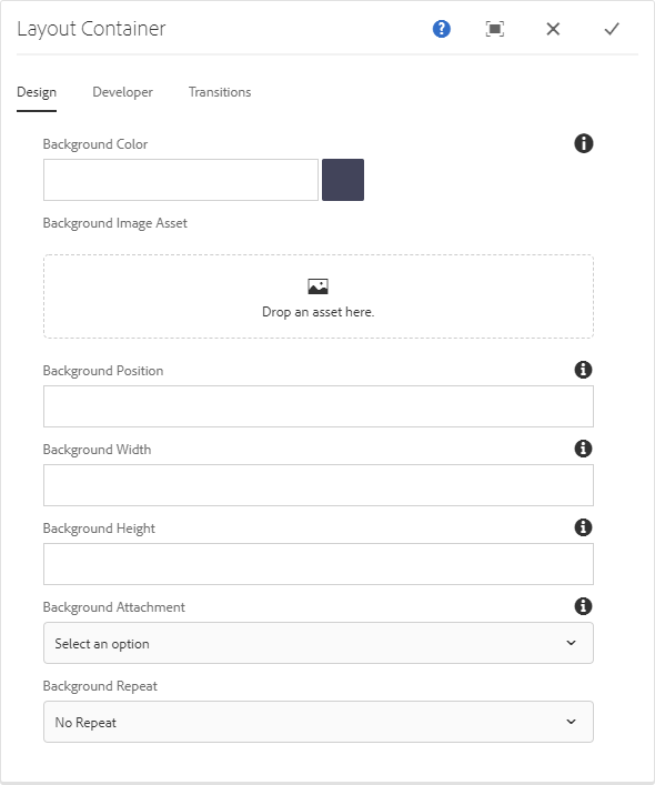
Design Tab
Be careful with text legibility
Choosing an inappropriate background color or image may make text inside the container illegible. If there is not enough contrast users may not be able to read your text.
| Field | Description |
|---|---|
| Background Color | Optional background color for the container. |
| Background Image | Optional background image for the container. |
| Background Position | The position of the image in the container. |
| Background Width | The position of the image in the container. |
| Background Height | The position of the image in the container. |
| Background Attachment | Sets whether a background image scrolls with the rest of the page, or is fixed. |
| Background Repeat | The repeat css value of the image in the container. |
Please note values you can use here can be found in any online resource, one example would be this: https://www.w3schools.com/cssref/index.php
Please only use the values if you are aware of what you are doing, most of the time the Teaser component can achieve it with the style/variants applied.
For the Background Width, you can use the value: cover to make the background image responsive and cover the whole screen in bigger resolution and in fit an area of the image in smaller resolutions too.
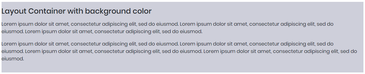
Background Color (Optional)
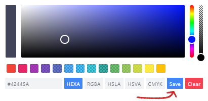
Click the Color Picker button to open the Color Picker Dialog box.
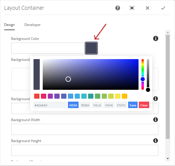
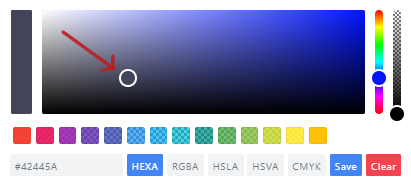
You can drag around the round picker to select the desired color or type in the HEXA, RGBA, HSLA, HSVA, CMYK value of the color if you have it.
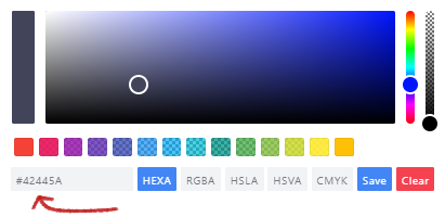
Click the SAVE button to confirm that it the color that you wanted.
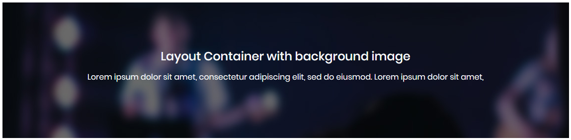
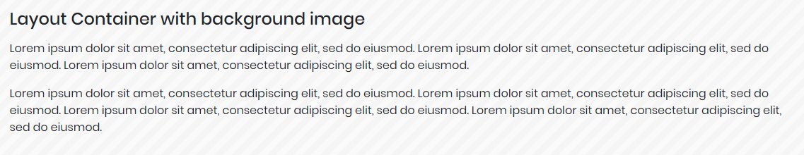
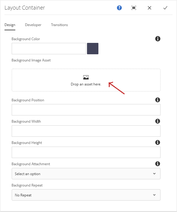
Background Image (Optional)
Prerequisite
You need to provide a background color for the background image to work.
Drag-and-drop an image from the Assets tab after toggling the AEM side panel (side kick). Ensure your image is meant for background use.
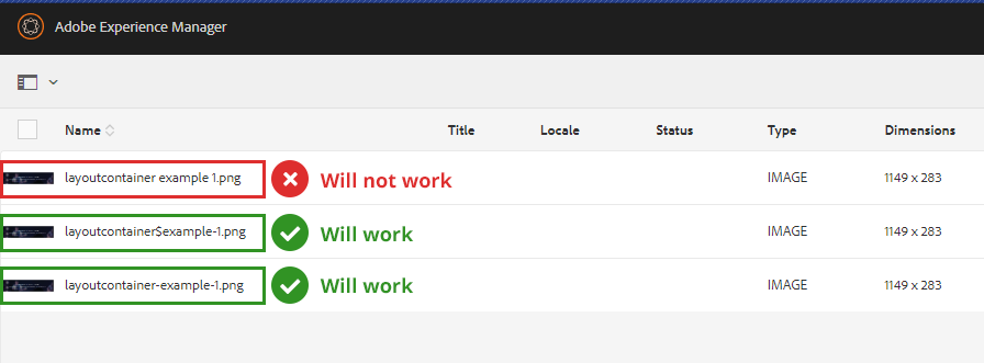
Background Image Names
The image will not display in the background if the image name has special characters or space in it. It’s the requirement of the CSS to display background images.
For example, this image asset will not work as background image: “layout container example bg.png“
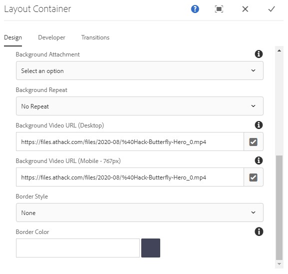
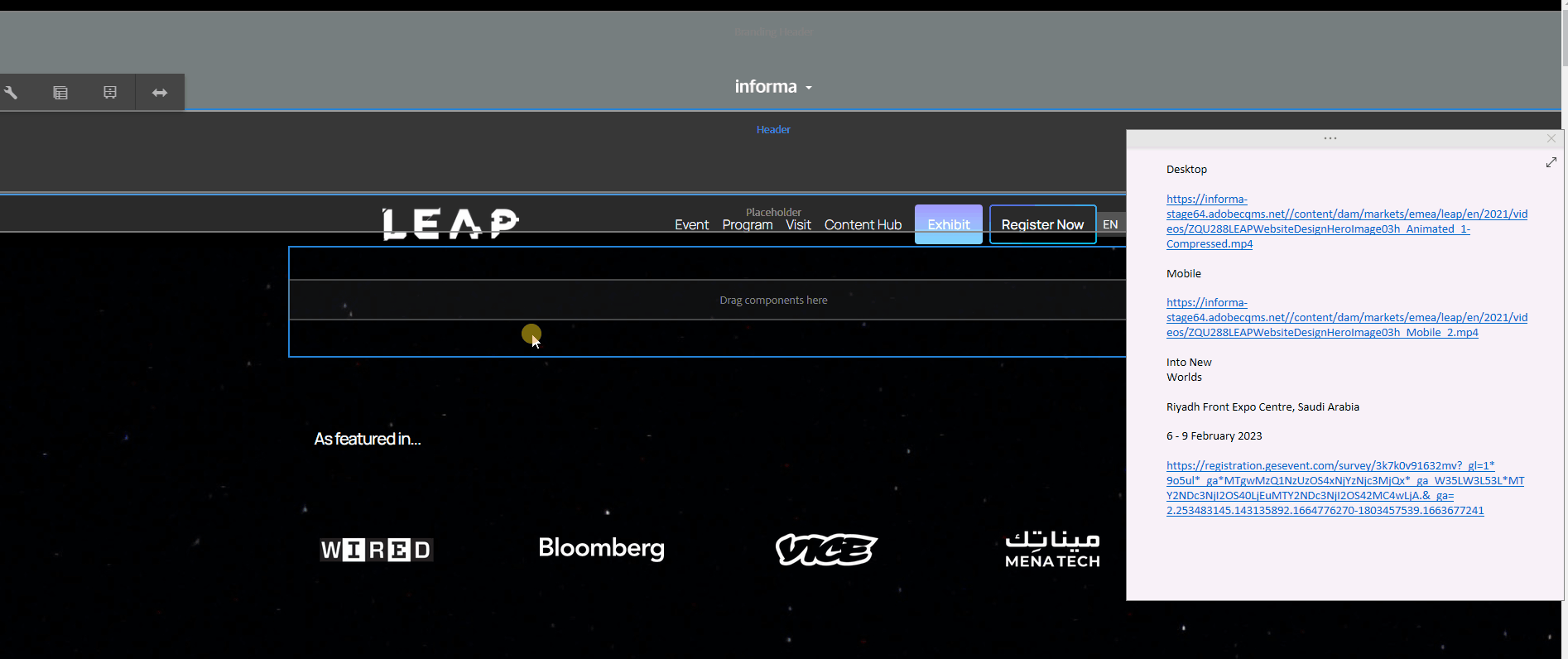
Background Video
You can now add background videos using the DAM path or an external URL.
You also have an option to have a separate video for Desktop and Mobile for better responsiveness of your layout.
Please take note of the path you'll configure to make sure the video is rendered on all browsers:
Path/URL format that works on all browsers:
https://informa-prod65.adobecqms.net/content/dam/markets/na/discover-boating-miami-international-boat-show/DBMIBS Website Hero Video_v4.mp4
Path/URL format that DOES NOT works on all browsers:
/content/dam/markets/na/discover-boating-miami-international-boat-show/DBMIBS Website Hero Video_v4.mp4
https://www.miamiboatshow.com/content/dam/markets/na/discover-boating-miami-international-boat-show/DBMIBS%20Website%20Hero%20Video_v4.mp4
Steps to display full video height:
Enable/check the Display full video height checkbox.
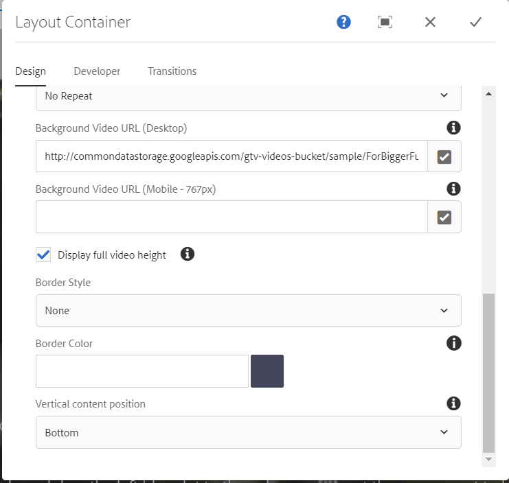
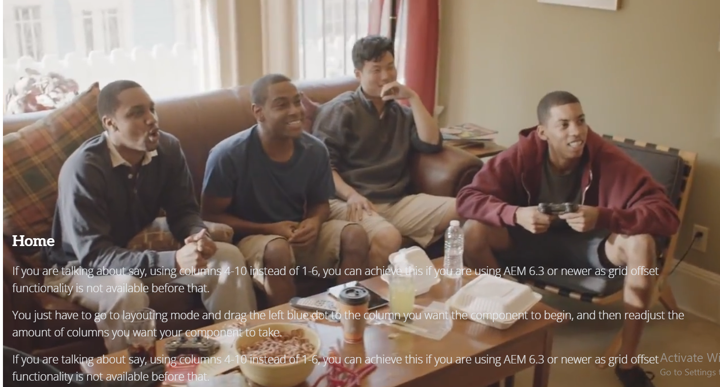
Vertical content position: We have provided 3 options (Top, Center, and Bottom).
if Display full video height control is enabled/checked, then, the content/text will show in the position accordingly. In the below screenshot, I have selected the bottom option so the content will be shown at the end.
Background Position (X Y)
The Background Position allows you to set the starting position of a background image. By default, a background-image is placed at the top-left corner of an element, and repeated both vertically and horizontally.
Below are the property values that you may use:
- left top
- left center
- left bottom
- right top
- right center
- right bottom
- center top
- center center
- center bottom
If you only specify one keyword, the other value will be “center”.
| Option | Description |
|---|---|
| X% Y% | The first value is the horizontal position and the second value is the vertical. The top left corner is 0% 0%. The right bottom corner is 100% 100%. If you only specify one value, the other value will be 50%. Default value is: 0% 0%. |
| Xpos Ypos | The first value is the horizontal position and the second value is the vertical. The top left corner is 0 0. Units can be pixels (0px 0px) or any other CSS units. If you only specify one value, the other value will be 50%. You can mix % and positions. |
Background Size (Width and Height)
The Background Width and Height field specifies the size of the background image. You may use % or pixels as unit for the values. For example, 100%, 300px.
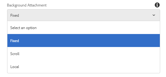
Background Attachment
Sets whether a background image scrolls with the rest of the page, or is fixed.
| Option | Decription |
|---|---|
| Fixed | The background image will not scroll with the page. |
| Scroll | The background image will scroll with the page. This is default. |
| Local | The background image will scroll with the element’s contents. |
Background Repeat
The Background Repeat allows you to set if/how a background image will be repeated.
| Option | Description |
|---|---|
| No Repeat | The background-image is not repeated. The image will only be shown once. |
| Repeat | The background image is repeated both vertically and horizontally. |
| Repeat-X | The background image is repeated only horizontally. |
| Repeat-Y | The background image is repeated only vertically. |
| Space | The background-image is repeated as much as possible without clipping. The first and last images are pinned to either side of the element, and whitespace is distributed evenly between the images. |
| Round | The background-image is repeated and squished or stretched to fill the space (no gaps). |
Styles
The layout container comes with a number of available styles that will be customized for your specific site and theme. You can use the styles selector to pick a style for your layout container.
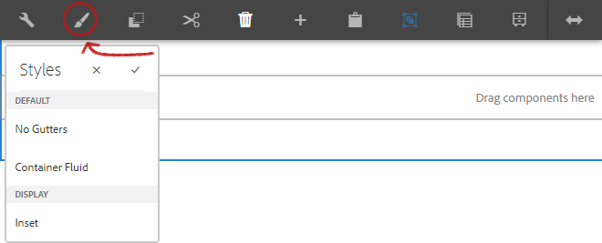
Available Styles
| Style | Description |
|---|---|
| No Gutters | When selected, left and right padding are removed. |
| Container Fluid | When selected, will remove the fixed-width. |
| Inset | No distinguishable difference. |
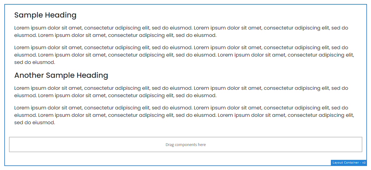
When to and why use the Layout Container
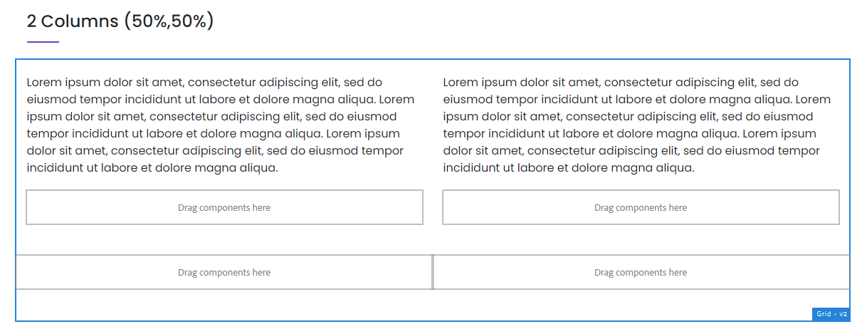
Use the Layout Container component if you only want to adjust the layout of two stacked content or information in author and make them sit next to each other as shown below. However, if you want to display a table-like information such as list of speakers with profile picture, use the Grid component instead.
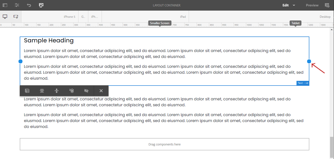
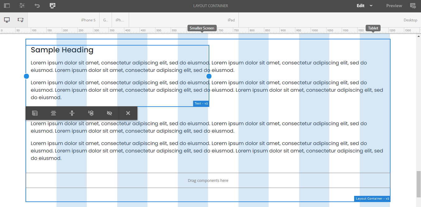
For example, in order to transform the layout of this stacked content,
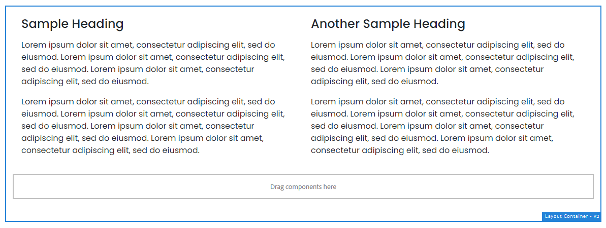
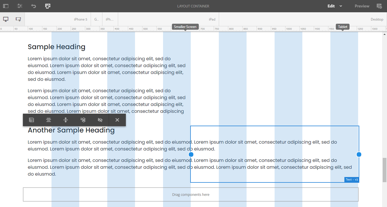
to this content that sits next to each other,
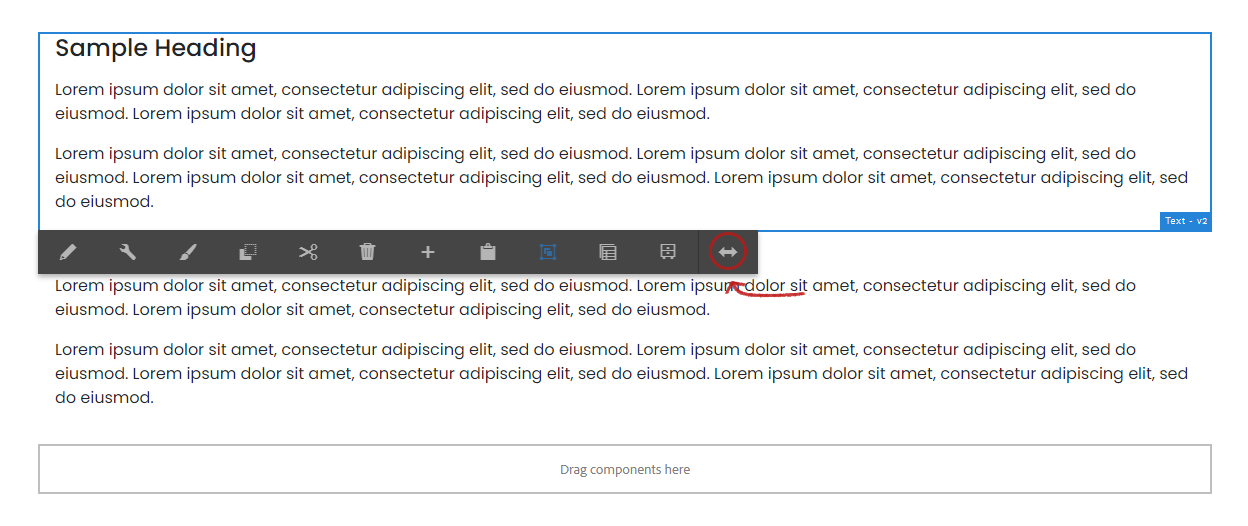
select the top Text component and from the toolbar click the layout icon.
Then drag the edge to occupy the half portion of the guided area and do the same for the next text component. They will then automatically snap and sit next to each other.
The layout is identical to what can be achieved using a grid component. You could make a 50% x 50% column or 30% x 70% column adjustments as it suits your need.
As you can see, this component offers authors a flexible way of handling columned content by leveraging the new feature of the system to adjust the layout or the positioning of the elements, hence, providing a better mobile and overall experience with less nested components.
Be careful of deeply nesting layout container or grid components
Too many nested containers can impact your page’s performance.
The background video can be configured in a layout container. Below steps and GIF will show how it is done.
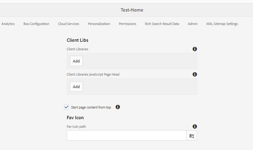
If you are doing this in a page where you want the background video starts from the top with the navigation infront of it, then a setting needs to be enabled.
In the page properties, under design, choose Start content from top and save.
To add the background video, do the following:
- Add layout container
- Set background color, any color will do.
- Past the source URL of your web and screen resolution optimized video in the Desktop and the seperate URL for the mobile.
- The option to display full video height can be enabled if not then the height will be depend on the content of the layout and spacing set.
From there you can now start adding your content and spacing needed to center the title, copy, in the layout container.
Copyright © 2025. All rights reserved. Informa Markets, a trading division of Informa PLC.